Carro 2.0 Design System
As a part of our comprehensive rebrand, we overhauled the app’s design system to bring it into alignment with the new aesthetic and position the Design Team and Front End Developers to rapidly prototype and produce new product features.
The prior design system was born out of the evolutionary process of creating the app from scratch, and was more of a compilation of pieces than a system. The revision gave us the opportunity to take stock and audit the app with the goal of identifying divergent or unnecessary elements and components, missing UI already implemented and discrepancies between Design and Development. Over time, we achieved parity between design and development.
As one of two Product Designers, I personally crafted the Design System in collaboration with my team.
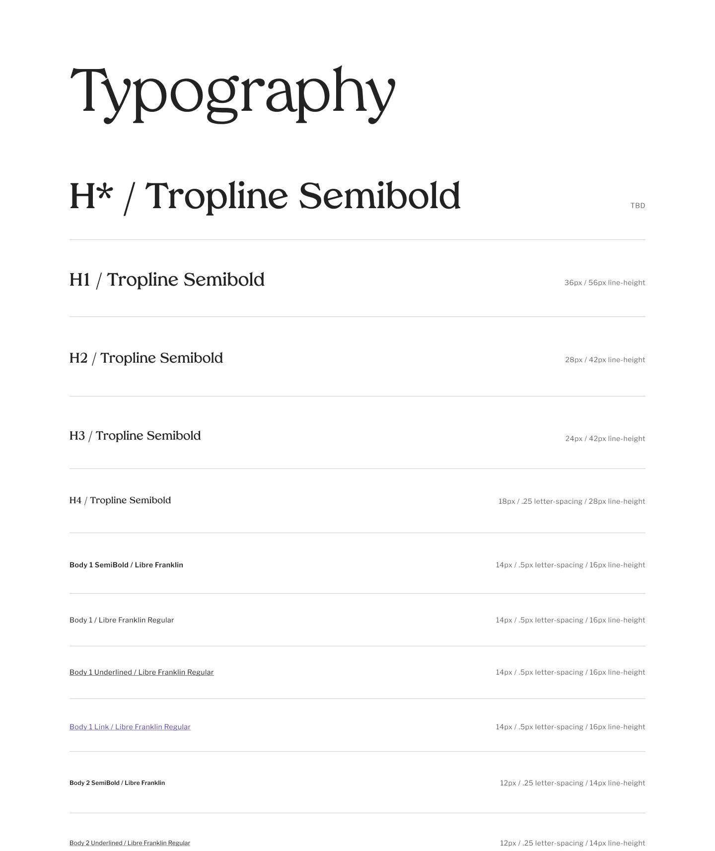
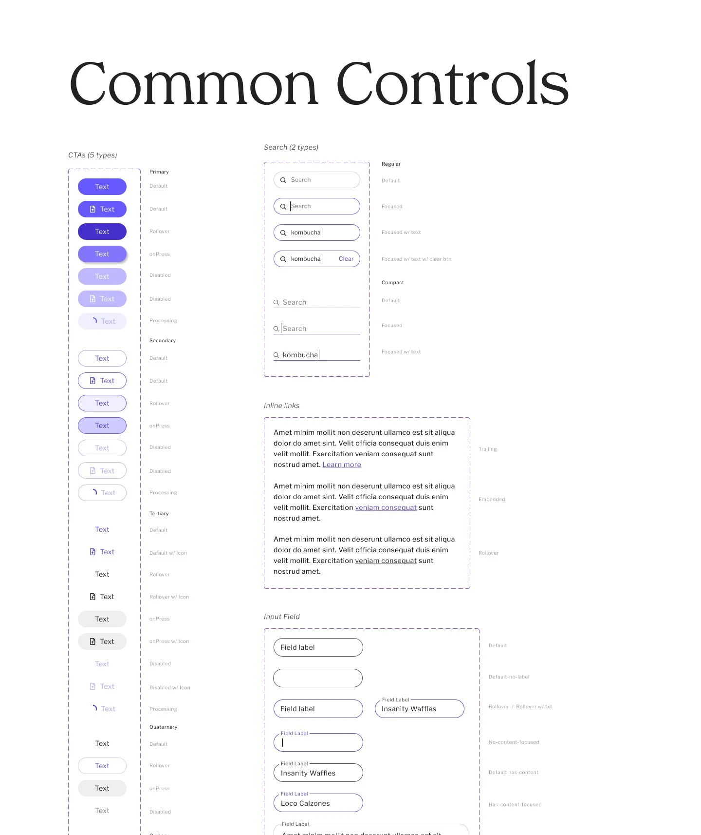
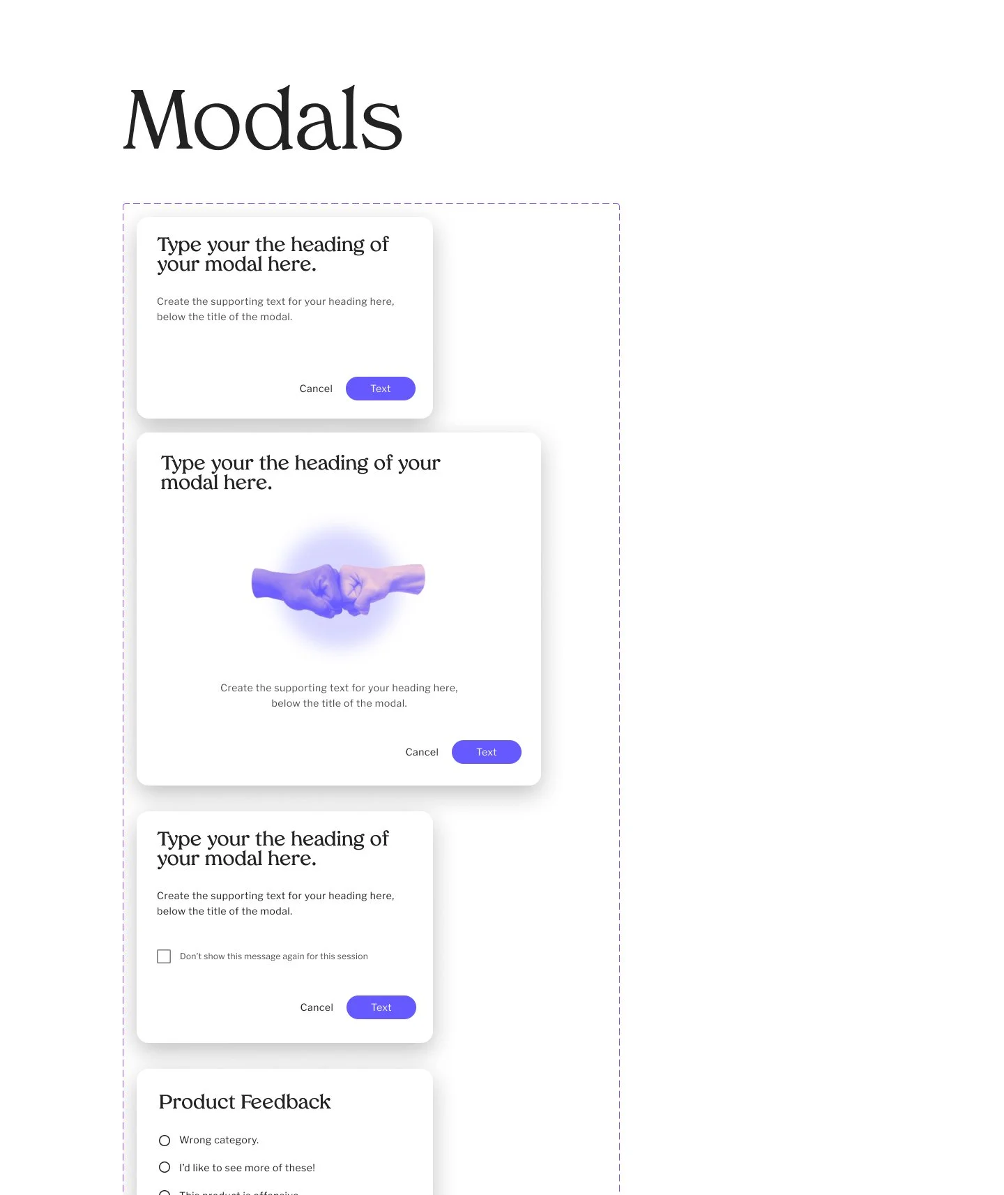
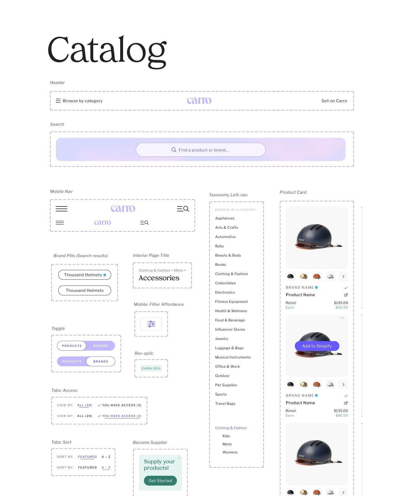
Both the original and the updated design systems were based off Google’s Material Design Library. This saved a tremendous amount of time (and cost), leveraging hundreds of pre-built UI elements with exceptional articulation of user feedback mechanisms and built-in responsive scaling. With light customization, the system felt bespoke and uniquely branded.
My plan for implementation occurred in two primary phases. First, because the existing UI was also based in Material UI, it was quickly revised to incorporate the updated color palette and typography in time to launch with other customer-facing branded experiences, such as the new sales site. Then, as a long-term and intermittent second phase, we implemented customizations to the UI and
A good design system is good for business – users, designers and developers.
The design system increased design and development velocity, and decreased post-development revisions from QA.
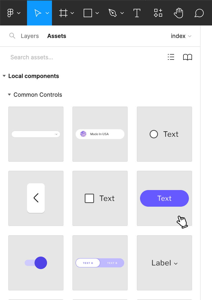
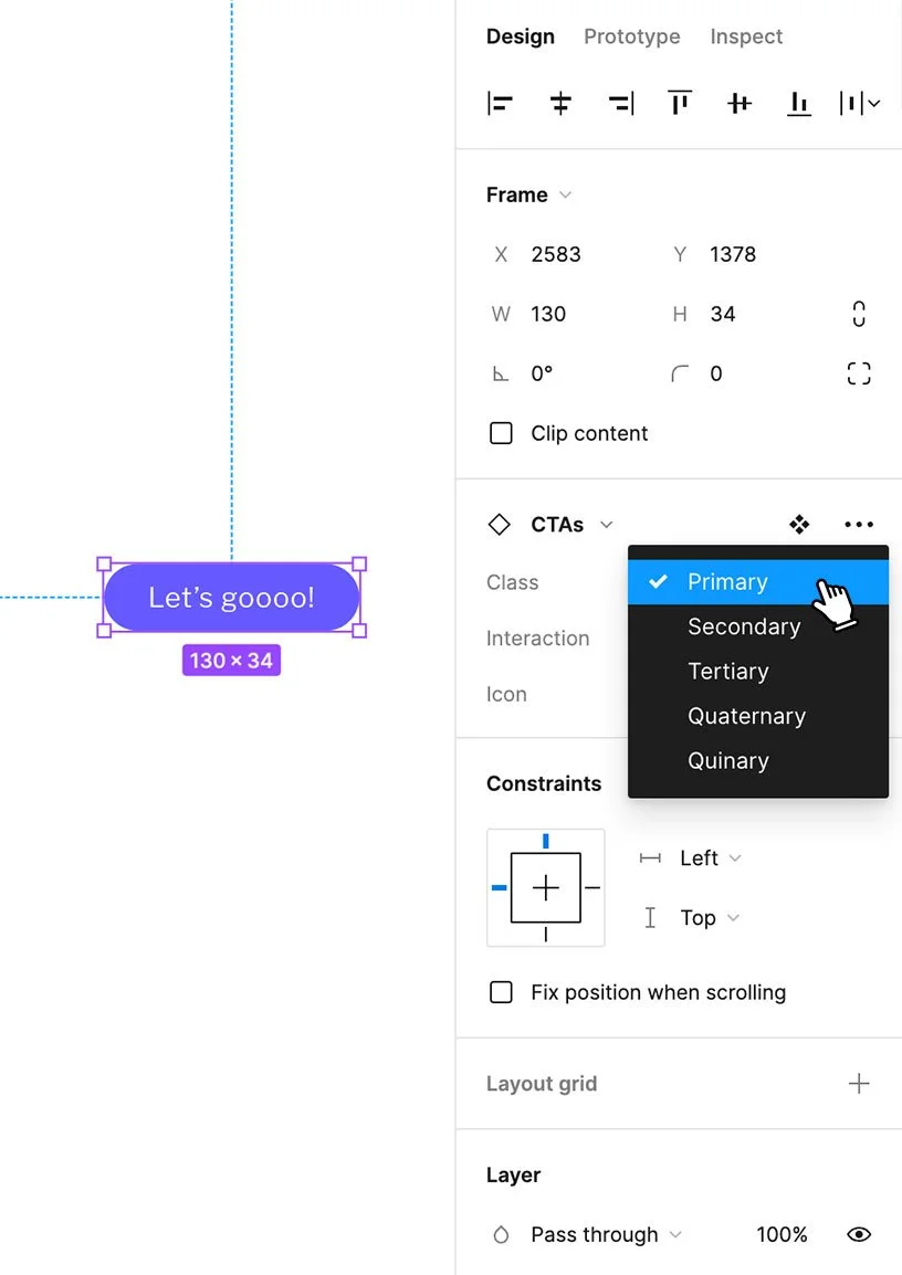
Built directly in Figma, the Design System enabled collaborative iteration, rapid prototyping and consistent design.
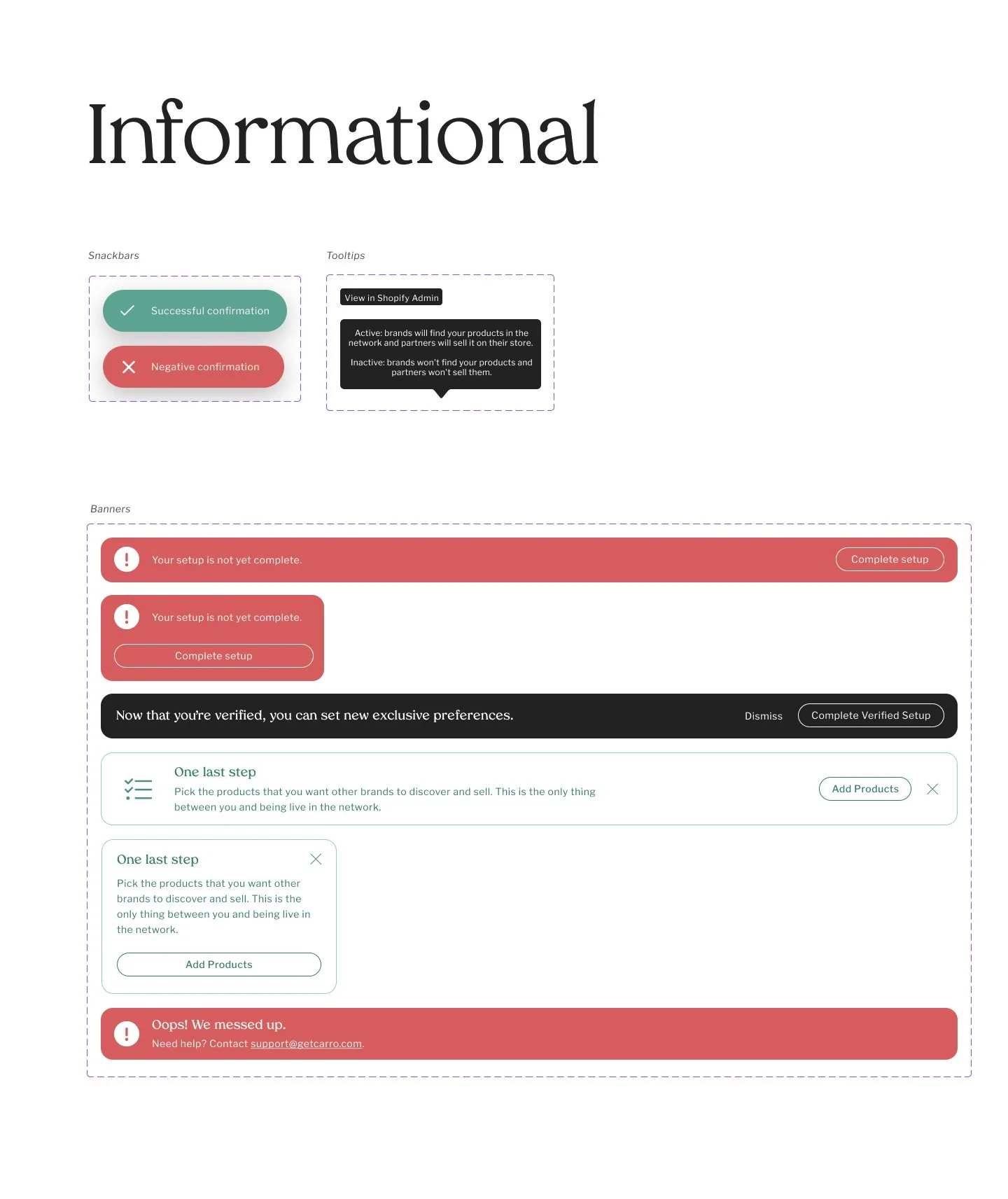
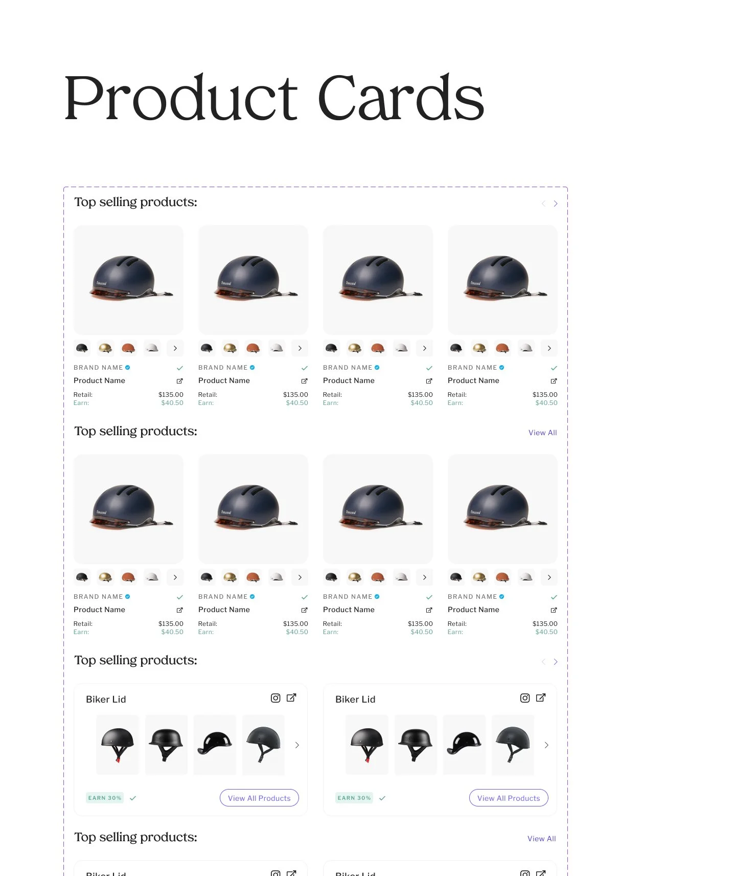
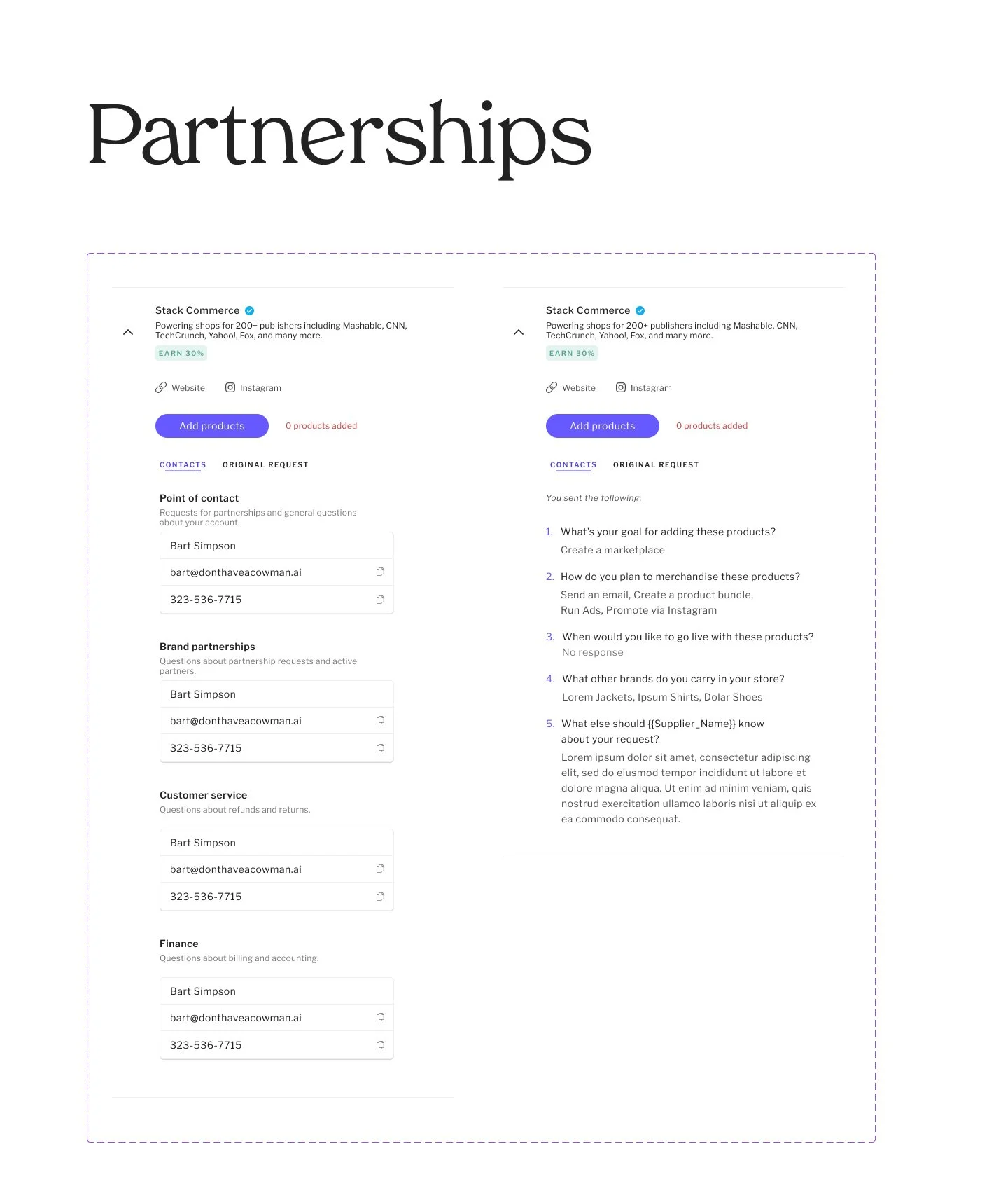
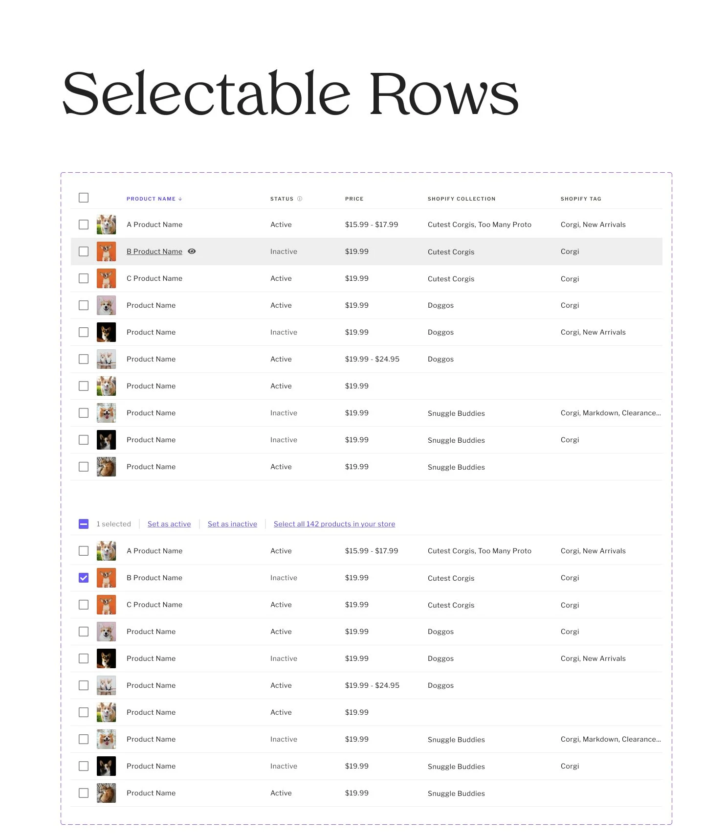
Figma Library / Design System Samples