Creating AFRM
I was approached by a private label clothing manufacturer about working with them to create a new direct-to-consumer brand. What a dream come true. I created and pitched a proposed business plan titled “The Blank Slate,” covering the primary areas of launching an eCommerce brand. With their approval, I collaborated with their Creative Director to create a brand that reflected the tone and message she wanted to bring forth to the world. Inside two years we launched and scaled the business north of $7m in revenue, selling online and in major retailers like Nordstrom, ASOS and Revolve. My responsibilities spanned branding, site design & development, marketing, team building and management.
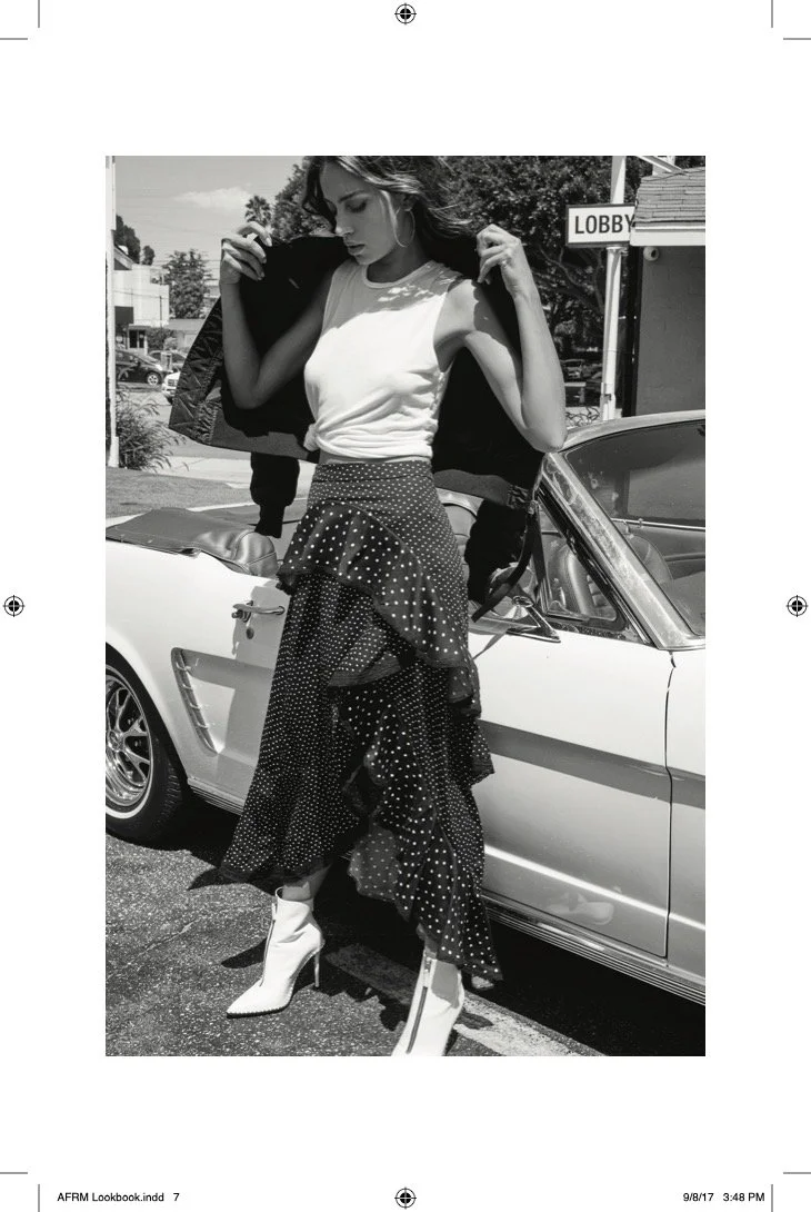
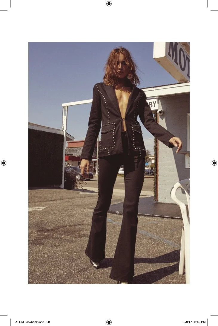
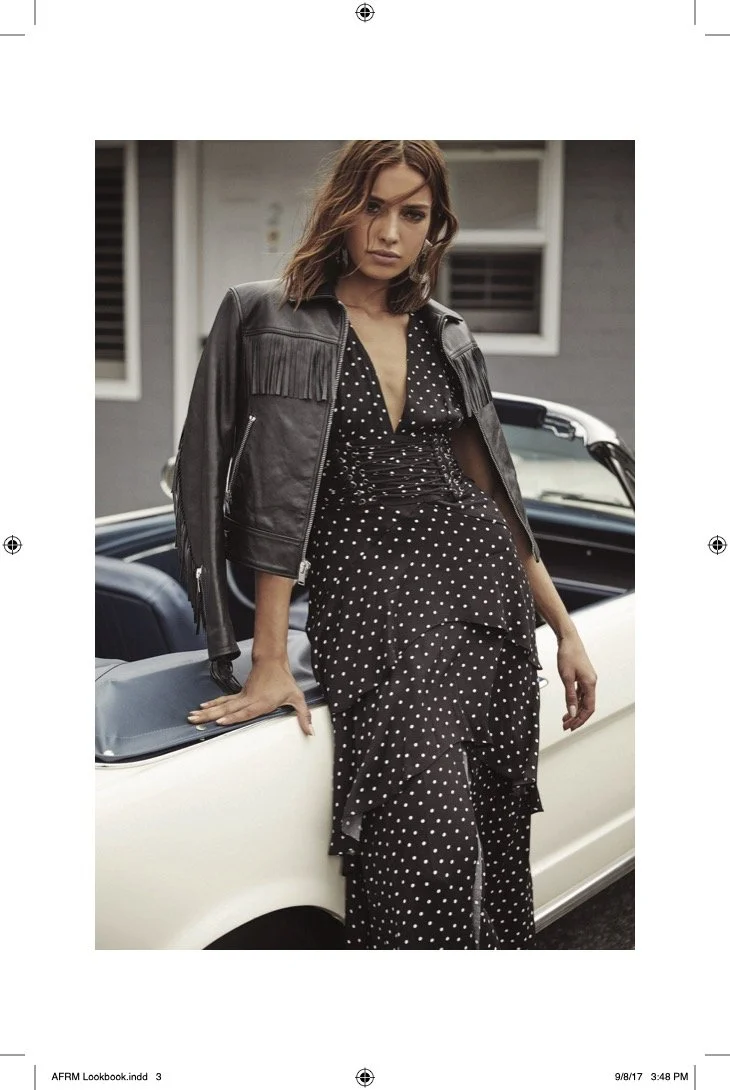
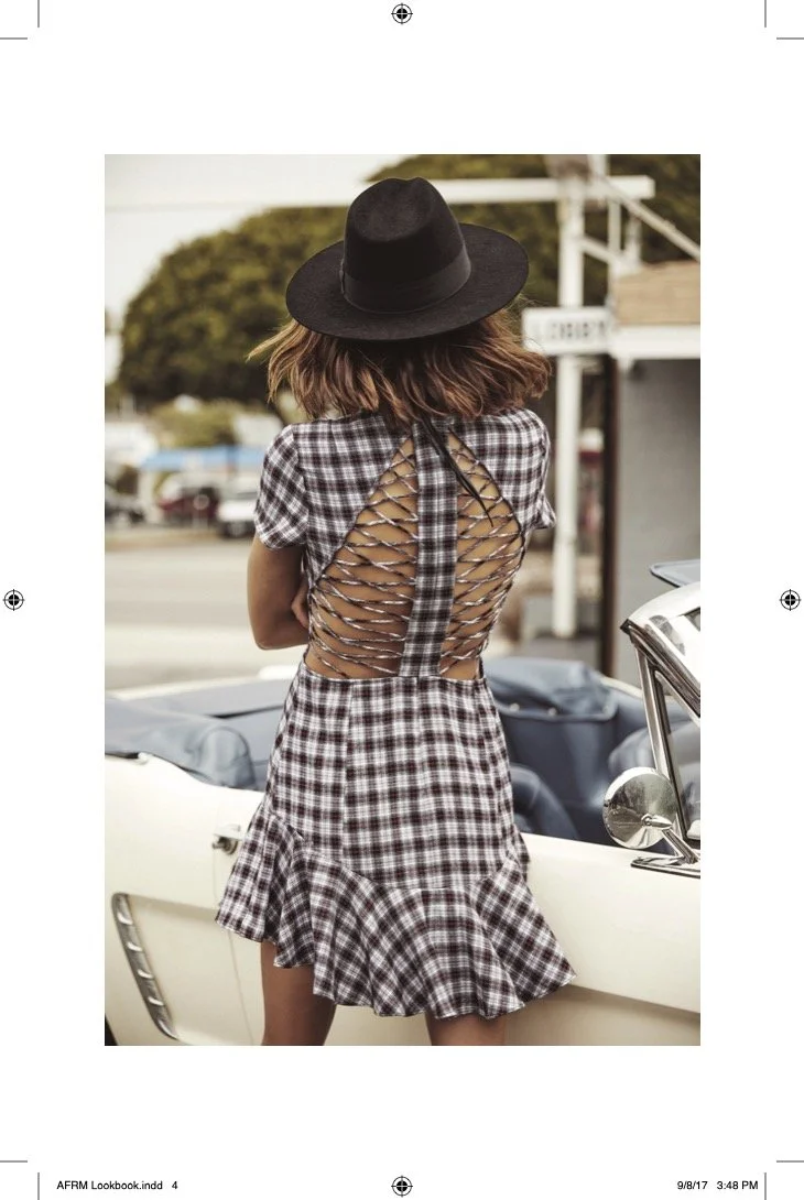
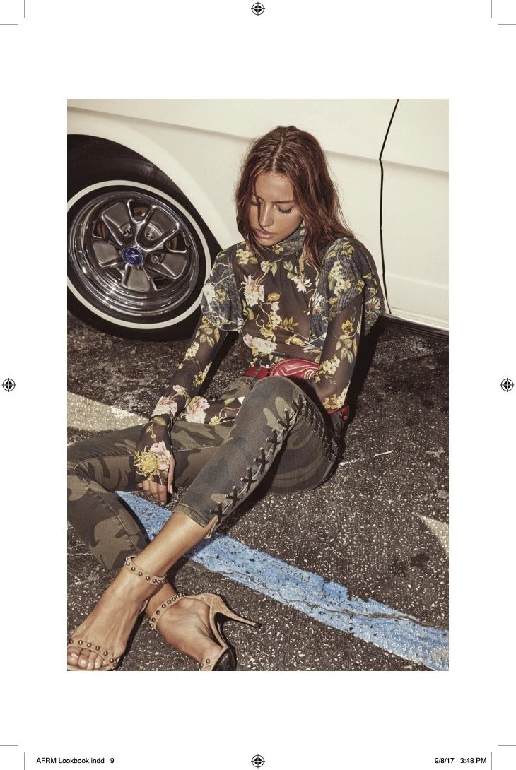
Recently, in Southern California
AFRM makes it’s debut to Coachella.
We started with Q&A style interviews, probing for the essential aspects of the brand that would form it’s character. I asked questions like, “If your friends were out to dinner, how would you want them to describe this brand?” The resulting answers coalesced into a sense of what we’d want customers to experience.
The brand would seek for its customers to feel…
Sexy.
Energized.
Inspired.
Compelled.
Confident.
Fabulous.
On-Point.
Fashion-Forward.
Connected.
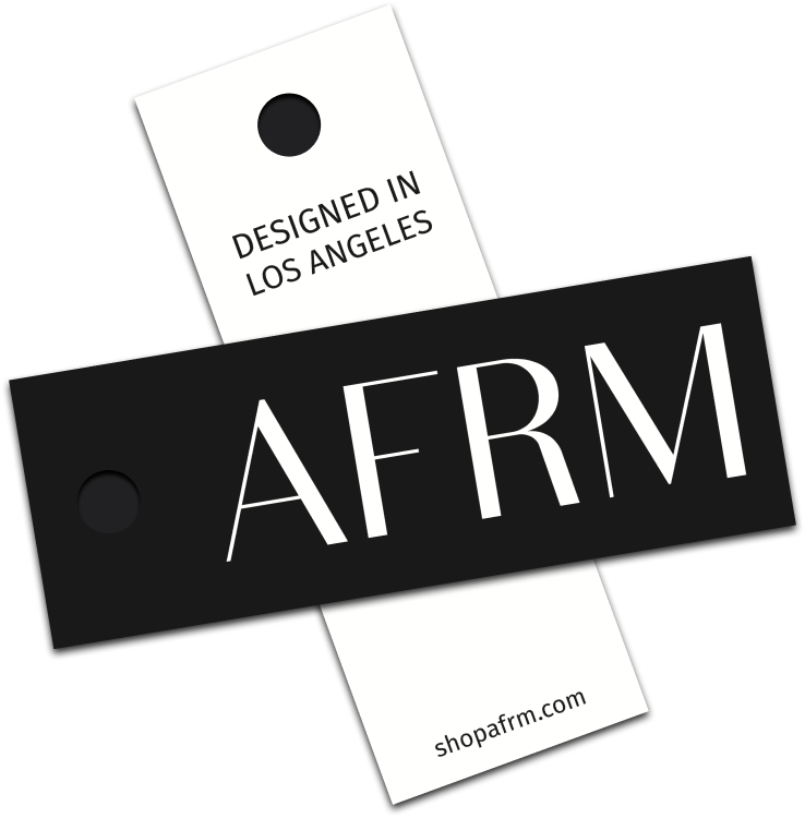
AFRM is an affirmation to every woman to live fully, and in style.
Definition like this framed our presentation of the brand and the touch-points with customers and are the guideing lights for special touches like our affirmation cards that we include in every package:
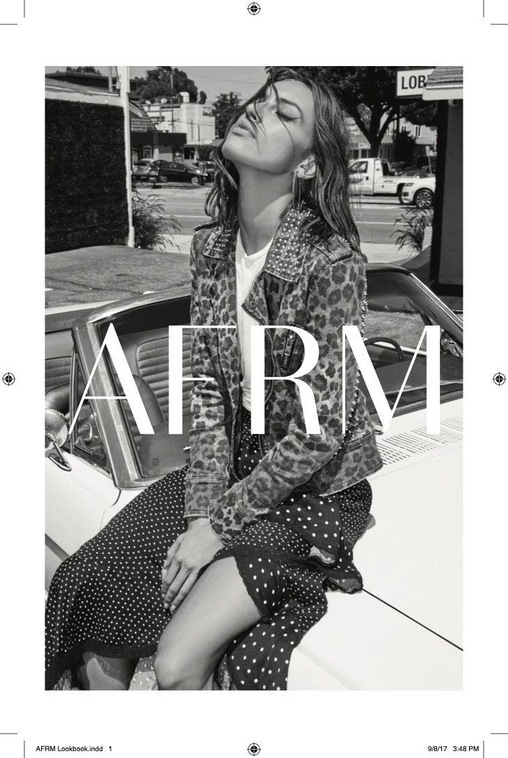
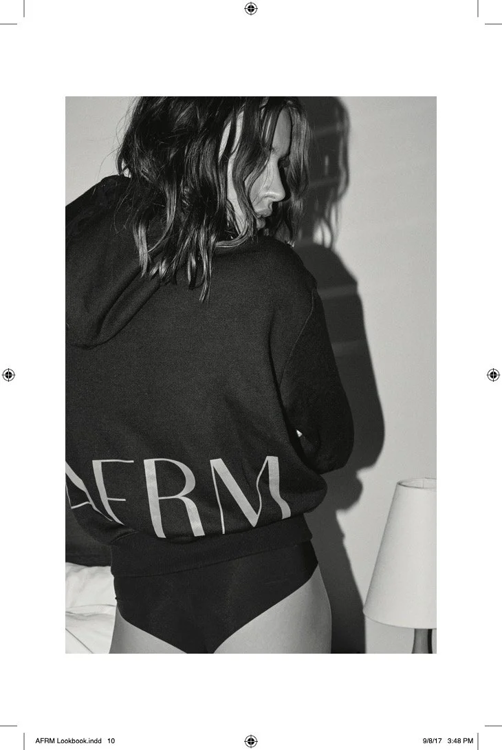
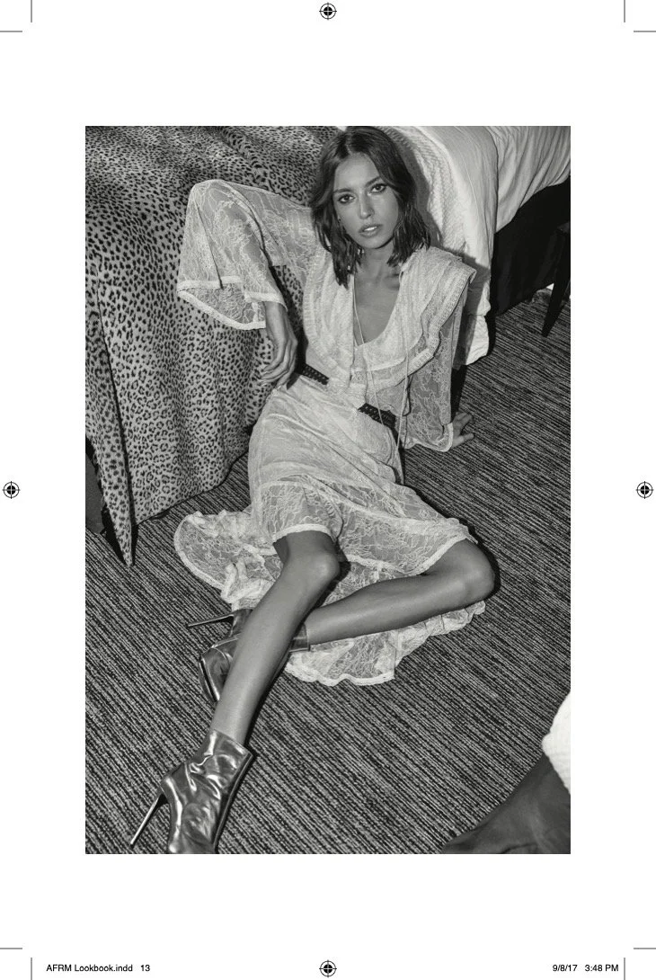
Photoshoot
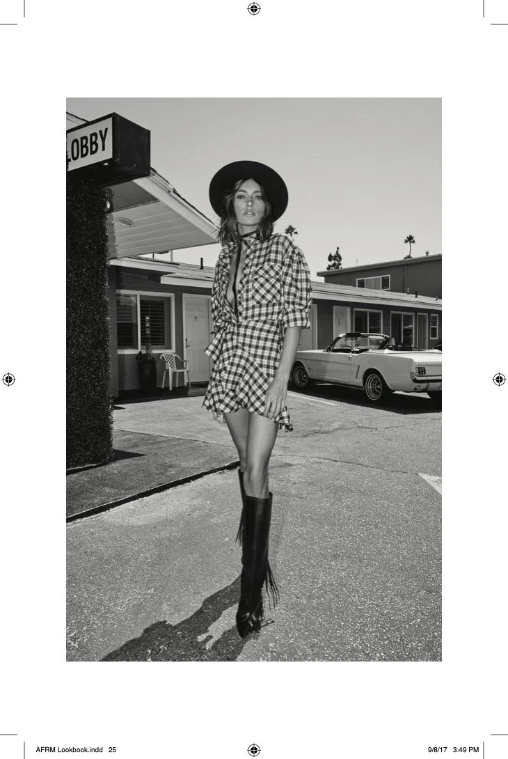
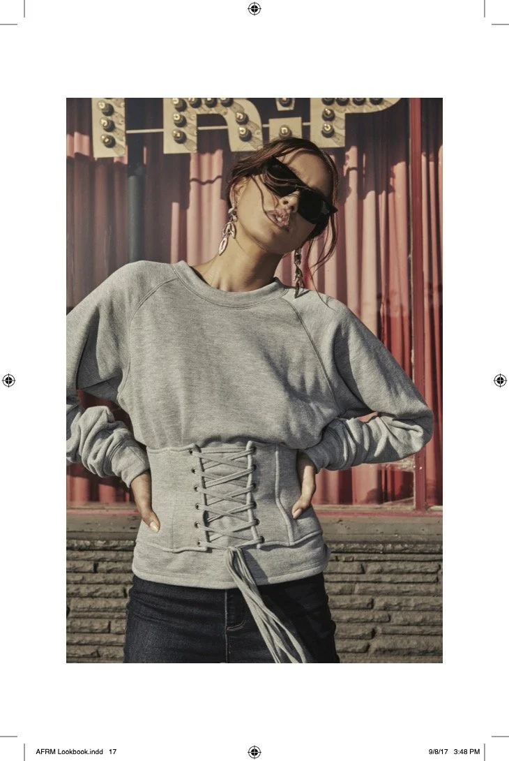
Previously, on Sunset Boulevard
AFRM makes it’s debut in Hollywood.
eComm Site Evolution
Building off a core Shopify template, we strategically customized key customer/user experiences like the Home Page, Category Page and Product Detail Page.
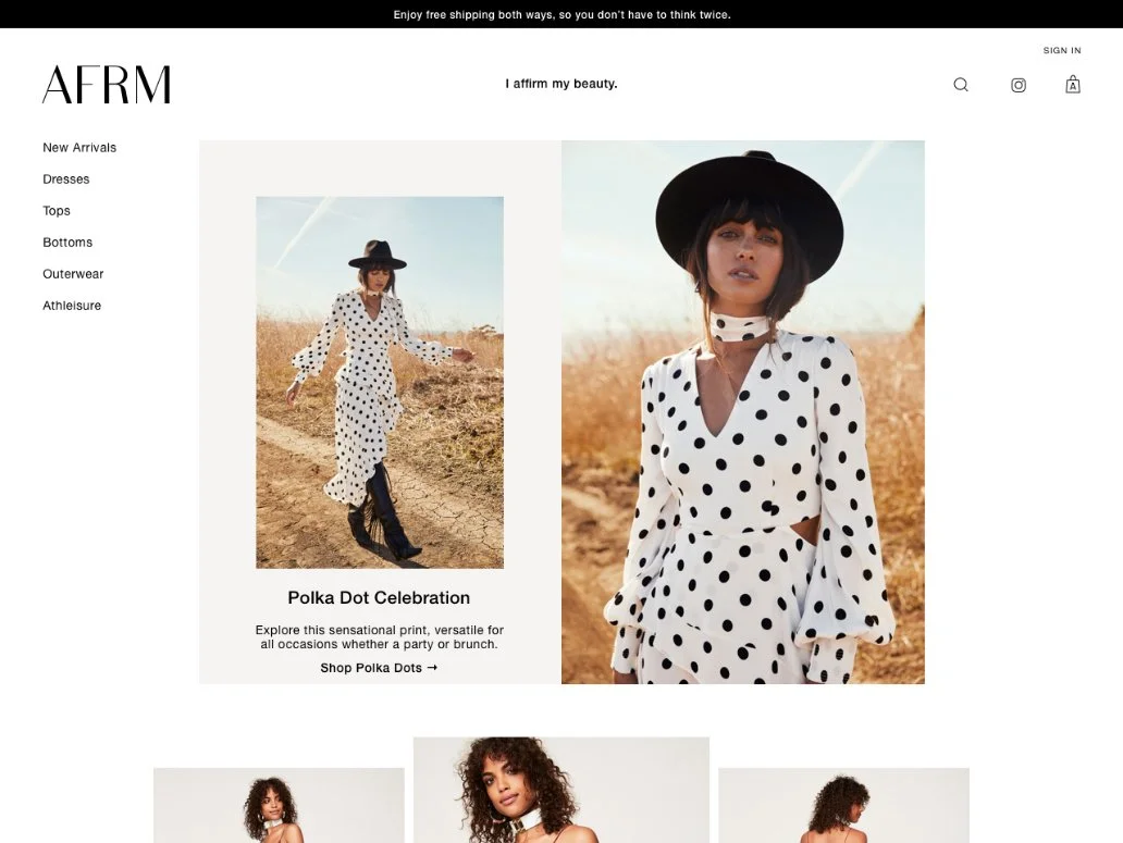
Home Page: Header
Starting with a simple left-side nav, similar to Zara, the design enabled us to place the carousel of affirmations in the top center of the screen:
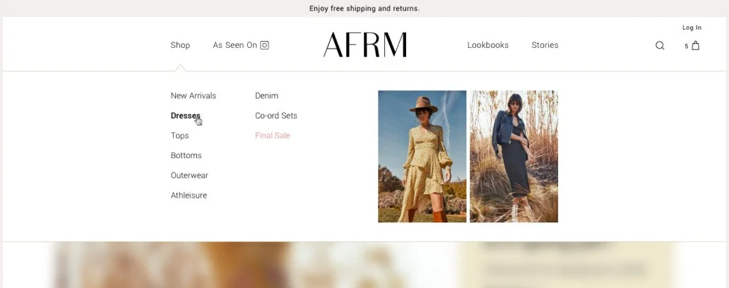
After expanding our assortment of clothing categories, we opted to test a more traditional top/horizontal nav that would enable a dropdown mega-menu and played with the placement of the shop Instagram feed:
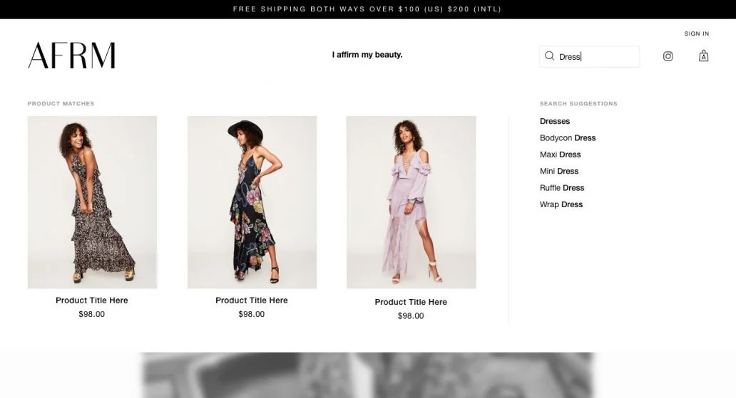
Later, we invested in the integration of a powerful search product, requiring custom UI design, that could present product recommendations and suggest auto-completed terms:
While Shopify had built a powerful template management tool, enabling easy reorganization of Home Page sections, etc., templates didn’t include flexible components. To regularly and efficiently change up our Home Page layout, I enabled our merchandiser to set any number of images with titles and descriptions, clickable to their respective Collection or Detail pages.
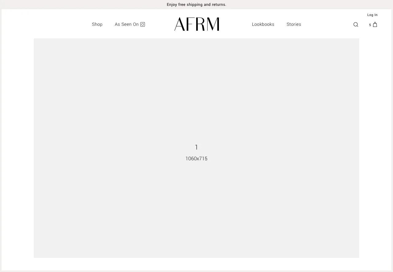
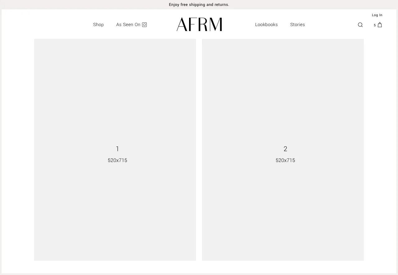
First, I wire-framed a set of photo layouts that could be easily transformed and rearranged for visual variety and evaluated their efficacy with the team:
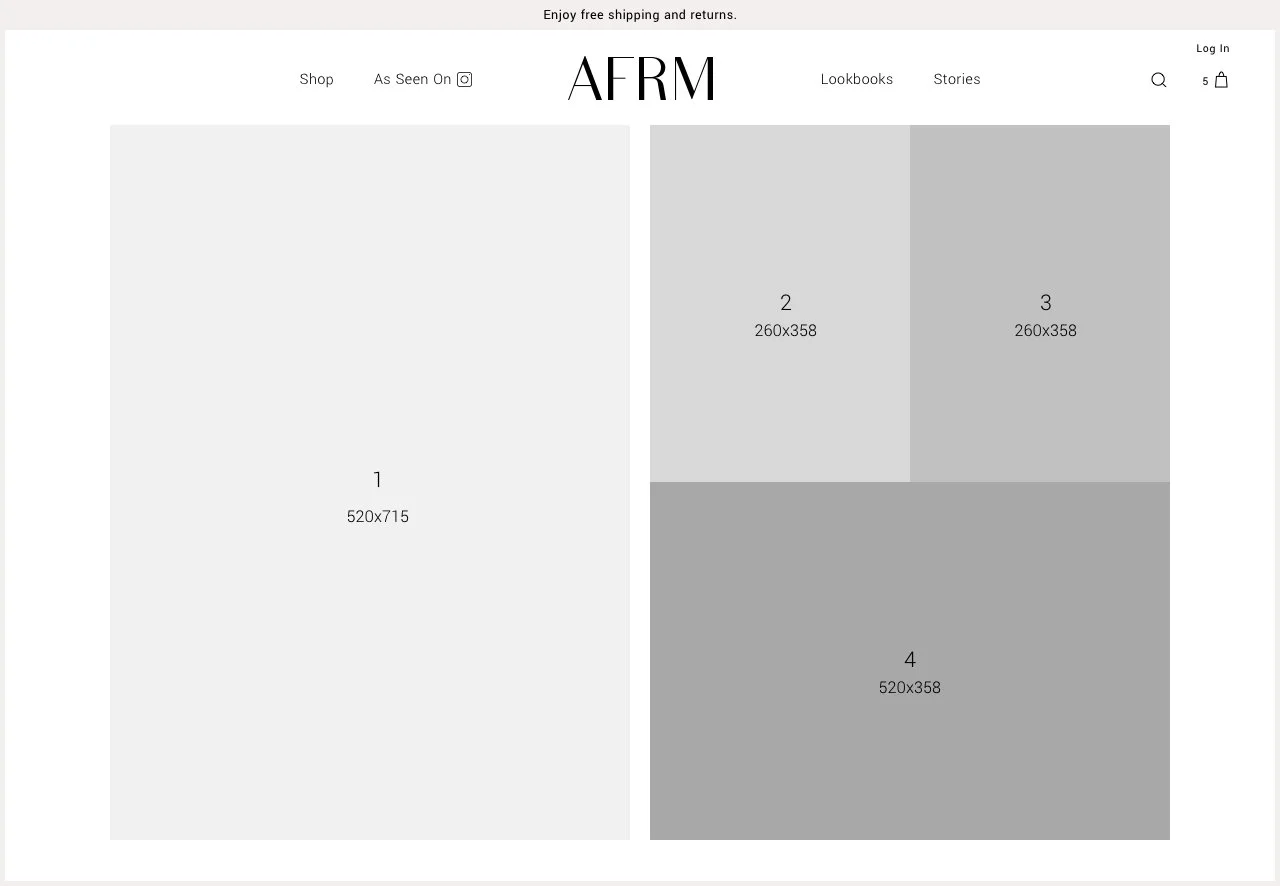
The implementation of these sections enabled a tremendous amount of flexibility and customization for the team, without dependency on development and rarely requiring support from design, as the merchandiser could simply upload a photo and input the supporting content.
Examples:
Collection / Category Page
In the customer journey, the primary purpose of a collection (or category) page is to organize products in a logical way such that the customer can quickly identify what they’re interested in purchasing. To this end, we didn’t diverge from a straight-forward grid layout. But, in time, we added dynamic recommendations to present alternatives to the category and filters to enable users to hone their set of products.
Recommendations:
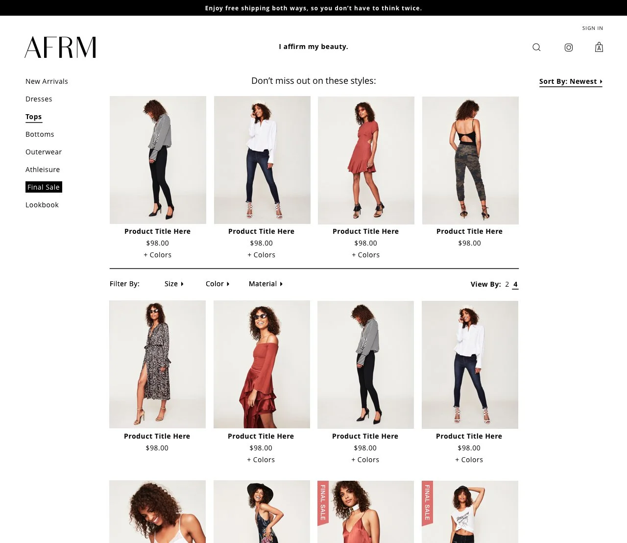
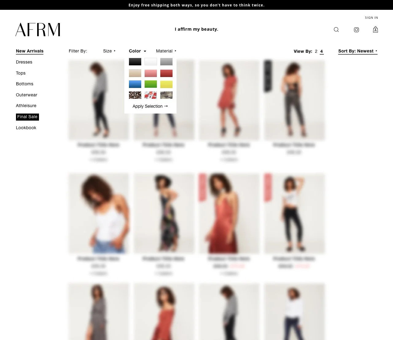
Filter by color:
Product Detail Page
Like the original home page design, the product detail took inspiration from Zara and other non-traditionally designed eCom sites aimed at providing an experience and maximized photography throughout the page:
But this layout created some technical friction, requiring more input and overhead from the team when setting up new products than we had anticipated, including setting the layout and uploading swatches of each pattern. In addition, when revamping the header, the left side of the PDP was availed to a more traditional image layout.
Throughout this process the mobile design received minimal updates for parity to the desktop version, having performed consistently well. For desktop, we simplified the layout and optimized for more above-the-fold presence:
Current eComm Site
In recent years, the parent company has scaled down the eCom team and focused on relationships with major retailers (referenced at the top.) Consequently, the site now reflects the minimalist strategy.