Simplifying the Weedmaps Marketplace
Reimagining navigation, location and marketplace discovery across desktop
Weedmaps had evolved over years into a powerful but increasingly complex marketplace. Search alone accounted for roughly a third of traffic, while retailer promotions, brand content, banner advertising and marketplace navigation all competed for customers' attention.
The challenge wasn't simply visual modernization. Our business model inherently produces a visually dense experience: retailers and brands need visibility, advertising is an important part of the platform, and customers need enough information to confidently choose among thousands of products.
We couldn't remove that complexity. We could, however, make everything around it dramatically simpler — and we could sharpen the two journeys that mattered most: finding a product through search, and finding it through categories.
I set the design strategy around one principle:
Reduce visual load. When customers make fewer, clearer, decisions on their way to the product they want, search and category discovery become more accessible, more legible, and more useful in the shopping journey.
That principle ultimately touched five interconnected systems:
navigation,
location,
search,
retailer cards
product cards
and page responsiveness.
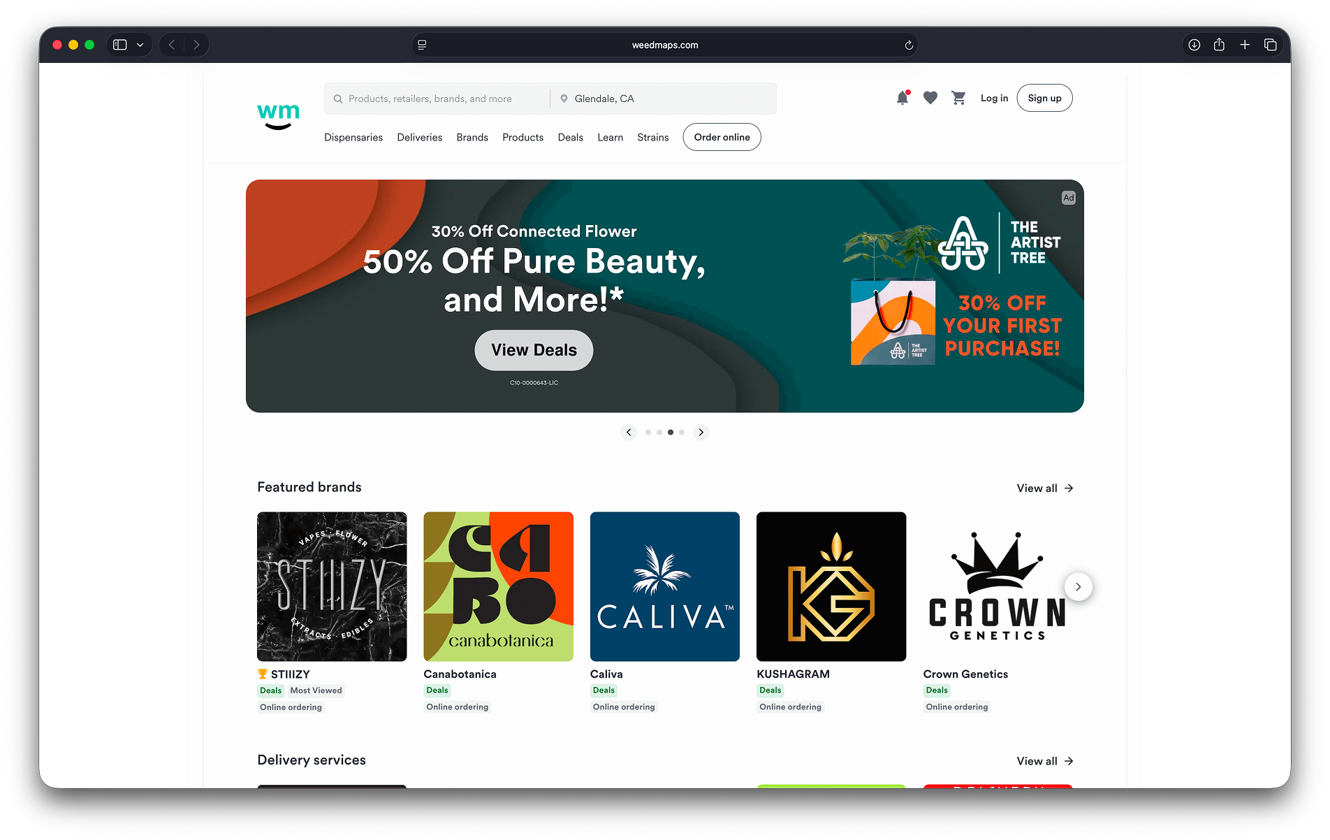
Before:
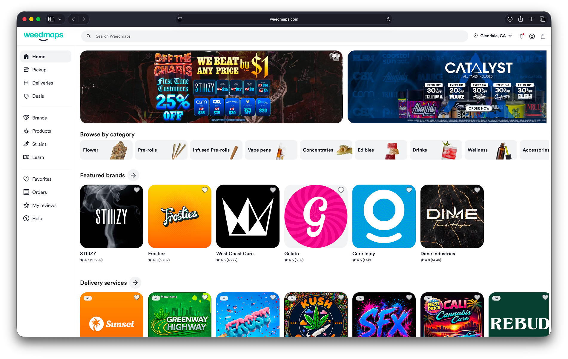
After:
Built for the day-to-day, structured for what's next
This work didn't happen as a dedicated project team pulled off the roadmap. It happened inside the normal operating rhythm of the marketplace pillar — which is the point.
I led the effort overall, working most closely with Dennis O'Neill, senior staff designer and owner of the Marketplace pillar. Because these changes lived primarily in the core marketplace experience, Dennis carried day-to-day responsibility for synthesizing the work, representing it to stakeholders, and shaping strategy alongside me. Mari Pearson, also on the marketplace pillar, led the location system exploration. Shawn Yourd, on the Search pillar, led search. Beyond that core group, we brought in the Growth and B2B pillars and the design system's owner, Rodney Nelson, as the work touched their surfaces — most notably David Gilman on Growth, where brand presentation and video were converging with our card and location work.
Making that possible was a matter of deliberate capacity planning, not luck or slack in the schedule. Two things made it work:
Dedicated time. We protected recurring space for forward-looking work — a "deal day," drop-everything-and-learn Fridays — where designers could push past the current sprint without it competing against roadmap commitments.
Project-load planning as a leadership discipline. As I worked with each pillar's staff or lead designer on their week-to-week roadmap, I deliberately shaped their workload so there was room left for future-state thinking — not as an afterthought, but as a planned part of their capacity. When a designer surfaced a forward-looking idea during ordinary project work, we made a habit of capturing and acknowledging it even when there wasn't time to fully explore it in the moment. Periodically, once an idea had enough shape to be useful, we'd bring it back to the team to evangelize it and get feedback — turning individual instincts into something the group could react to and build on.
That combination is what let five designers, embedded in three different pillars, end up converging on one coherent vision without ever being pulled onto a dedicated "future of the marketplace" project.
Navigation: Creating a clearer path through the marketplace
The legacy desktop experience placed a horizontal row of navigation directly beneath the primary search input.
This created several problems.
Navigation competed visually with Search — already responsible for roughly one-third of Weedmaps traffic — and the same navigation concepts had to reappear within Search experiences. Categories such as Products and Brands became repetitive and insufficiently differentiated, while the header itself accumulated more and more visual weight.
That complexity was particularly costly on Weedmaps. Retailer imagery, brand promotions and banner advertising already make the marketplace visually intense. Our own interface shouldn't add unnecessary competition.
Competitive scans of adjacent marketplaces suggested a broader pattern worth exploring: DoorDash had moved desktop navigation away from a traditional horizontal header and into a left-side architecture. We explored the same fundamental shift for Weedmaps, moving primary navigation into a dedicated side rail with a hide/reveal interaction. (Side note: After some effort, we were able to recruit the designer from DoorDash to our team, Vince de Asis, who had executed this and other admirable updates to their product.)
The result gave Search significantly more visual prominence while making navigation itself more distinct when customers chose to use it.
This wasn't about removing capability. It was about reducing the number of things asking for attention at once — and making the two journeys we cared most about, search and category browsing, easier to start and easier to trust.
User Location: Making location hard(er) to overlook
The customer’s location is fundamental to Weedmaps: changing it can change the retailers, products and fulfillment options available to them.
Yet the existing interface treated Search and Location almost as a single control.
Search occupied the left side of one large input while Location sat on the right, separated only by a divider. In usability terms, an essential marketplace setting was effectively buried inside another interaction.
Mari led the redesign of this control — and in doing so, surfaced a larger opportunity: location needed to become a systematized feature rather than an input.
Under my guidance, she mapped location journeys across personas and permutations to understand what could happen before, during and after a customer searched.
What if someone was traveling?
What if their previously selected market was hundreds of miles away?
What if they frequently shopped from several locations?
What if Weedmaps knew from GPS or IP-derived location that the selected shopping location was unlikely to be correct?
The resulting future-state experience introduced concepts common to mature marketplaces such as Walmart, DoorDash and Instacart:
Distinct Search and Location controls
Saved and named locations such as “Home”
Awareness of the customer's approximate real-world location
Friction and warnings when selected and current locations diverged
Clear recovery journeys for travelers and returning customers
Location-aware marketplace and fulfillment options
For example, when Weedmaps detected that someone appeared far from their saved location, we could intervene before they spent time shopping the wrong marketplace:
“Oops, it looks like you're far away from home. Do you want to update your address?”
The goal wasn't simply a better location picker. It was to prevent customers from unknowingly making decisions against an irrelevant inventory set.
Making fulfillment match the customer's mental model
Location also exposed an information-architecture problem.
Historically, Weedmaps navigation distinguished between Dispensaries and Deliveries. Working with our SEO partners, Dennis and I reconsidered whether those terms reflected how customers actually thought about fulfillment.
In markets where delivery was available — including major markets such as California, New York and Michigan — the meaningful distinction was simpler:
Pickup — I go to my purchase.
Delivery — My purchase comes to me.
Where delivery wasn't available, Dispensaries could remain an appropriate catch-all.
This gave us an architecture capable of adapting to the regulatory and fulfillment realities of each market while presenting customers with a much simpler decision.
Reducing every card to what matters
One of the smallest interventions became the catalyst for a much larger design exploration.
The original assignment was straightforward: replace repetitive “Add to Cart” buttons with the increasingly familiar + affordance used by marketplaces such as DoorDash.
Removing those words dozens of times across a product surface immediately reduced visual noise.
But the new elliptical control exposed another problem.
Its curvature conflicted with the corner radii of the cards containing it. Nested together, the two geometries felt unresolved.
Rather than treating this as an isolated component adjustment, the team used it as an opportunity to ask:
What should the next generation of Weedmaps marketplace components look like?
We explored more intentional nested radii between containers and controls, then expanded the investigation to the information architecture of the cards themselves.
Product and retailer cards had accumulated substantial amounts of information over time. We simplified what was presented, strengthened hierarchy, and established more predictable locations for metadata and tags — such as product category or delivery availability.
The objective was not minimalism for its own sake.
Every element we removed or reorganized gave the customer slightly less information to parse before making the next decision — and made the product they were looking for easier to find and easier to trust.
The result became a forward-looking component language for both product and retailer discovery.
Designing beyond the immediate roadmap: A future-state marketplace
This work reflects an important part of how I lead design teams: I expect designers to execute against today's product needs, but I also deliberately structure their capacity so they have room to explore where the product should go next — and I make sure those explorations don't stay isolated.
Individual explorations are useful. Aligned explorations become strategy.
Over the course of the quarter, Dennis worked at the center of that alignment — connecting the search implications of the work with Sean, the location system with Mari, and the emerging overlap with brand presentation and video with David on the growth pillar. That was sustained, week-by-week collaboration across three pillars, not a single hand-off — the kind of ongoing synthesis that only happens when the people closest to each piece are already talking to each other regularly.
My role was to make sure that synthesis had somewhere to go: to connect what Dennis, Mari, Sean and David were each building toward into a single coherent future state, and to make the case for it when the moment came.
That approach allowed us to bring these threads together into a single prototype of a modernized Weedmaps desktop experience — built over roughly a quarter, from exploration in Q2 to the start of implementation in Q3.
Given the opportunity, we pushed the vision further.
We designed a desktop Dark Mode, bringing web closer to capabilities already available in our native iOS experience while creating an aesthetic particularly natural for Weedmaps' audience and product.
We incorporated the new navigation architecture.
We incorporated the new location system.
We incorporated the emerging marketplace card language.
And we demonstrated how those systems could coexist within a simpler, more cohesive responsive experience.
Search was another major component of this strategy and became a substantial initiative of its own.
Vision creates optionality
The full marketplace overhaul wasn't the original assignment.
The prototype was ultimately presented to our CEO in the context of reviewing another initiative: an AI-powered shopping assistant.
But because I had structured the team's capacity to leave room for this kind of thinking — and because Dennis, Mari, Shawn, David and Rodney had been aligning their explorations across pillars for a quarter — we could demonstrate the assistant inside the marketplace experience we believed Weedmaps should become.
The CEO approved the broader vision.
An interaction that began with an Add to Cart button had helped catalyze a new component language. Navigation exploration had become a new desktop architecture. Location improvements had become a location system. Independent forward-looking design explorations, made possible by deliberate capacity planning across three pillars, had converged into a cohesive vision for the marketplace.
That's the strategic role I want design to play — and the operating model that makes it repeatable, not a one-time accident:
Give people room to think past today's ticket. Keep their explorations connected to each other. Then, when the opportunity comes, you already have the plan.